I can’t remember exactly when my passion for photography began, but what kept the passion going over the last many years was because of the immense amount of satisfaction I get when I saw the photos I captured. They may not be perfect shots (in fact more than 50% of the shots I took were embarrassing!), but they told the stories and experiences I had. The invention of digital cameras was ingenious, and because of that, even amateur photographers can just snap without a second thought because they know they can sift through thousands of photos afterwards and keep only those that turned out good. But on the flipside of things, it also meant that we have lost the joy of holding hardcopy photographs in our hands. Now, we admire our photographs on the screens of our phones and laptops. Still good, but it is just different from hardcopies.
Because of that, many of my friends would print out their favorite photographs or even print them into photobooks to commemorate special occasions or memorable family travels. I had not done so myself personally until I was approached with an opportunity to review Canon HD FotoJournals. Now that I’ve tried it and seen the final products for myself, I don’t think I can stop anymore. =P
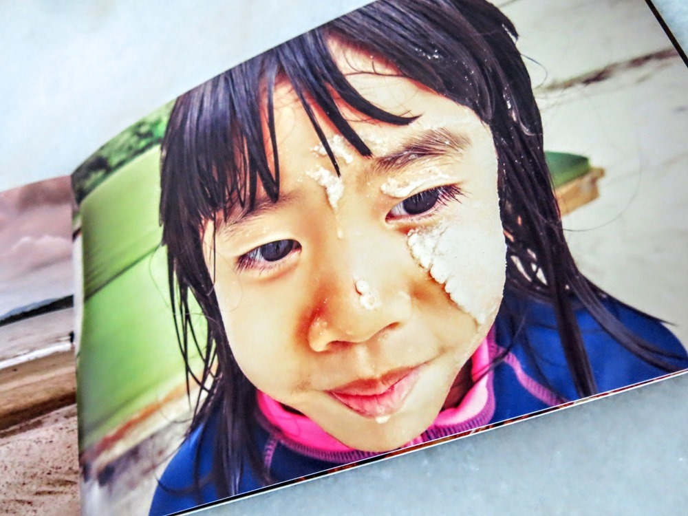
I made two Canon HD FotoJournals and I couldn’t decide which I liked better. The rectangular journal (Landscape 8” x 12”, 20 pages, S$75.00) is a documentation of our experiences at Telunas Resort a couple of years back, where we were immersed in the beauty of Nature and surrounded by sea, sand, skies and fishes everyday. The square journal (10”x 10”, 20 pages, S$125.00) is a collection of the husband’s photographs taken on his film camera. Every single shot told a unique story of its own and so beautiful. One thing is for sure though – I absolutely LOVE how the FotoJournals turned out!
The wonderful part about creating your personal FotoJournals is that you get to customize, beautify and decorate every page according to your likes. Don’t worry if you are not a creative person because there are preset templates and layouts within the program to help you along. The program is user-friendly and very easy to follow. This program I am talking about is the FotoHub program, which you will be instructed to download after you’ve purchased your FotoJournal from http://shop.canon.com.sg/photobooks. Just follow the instructions accordingly, upload the photographs that you have selected to be in the FotoJournal and you are good to start designing.
Even though the number of pages is fixed (Depending on which option you purchased), you can have as many photographs included as you like. When you see the inside pages of my FotoJournals, you will know what I mean.
There are many ways to personalize the journals – You can choose the type of layout, background color, background designs/wallpapers, insert captions, treat your photographs with filters and even simple editing in brightness, contrast, sharpness, etc. One great feature I’ve discovered is that the program will prompt you if the photograph you have selected is not high-resolution enough for the printout to look perfect. You then have the choice whether to still go ahead or choose another photograph. Once the photographs are accepted, you can be assured that the printout will look great.
To give you a better understanding of the various features in the program and see the different design possibilities, let me show you my FotoJournals. I am biased but I think they look perfect. =P
As you can see on this page, I didn’t opt for full-page image so that I can add in a wallpaper and insert a caption. Tip: The program uses installed fonts on your laptop/computer, so before you get started, make sure you’ve downloaded fancy fonts that you would like to use in your journals.
This page is similar to the one above, except that I aligned the photograph to one side and gave it a flowery wallpaper to match the colors of the image.
This is one of my all-time favorite shots of Joey and I gave it a Sepia treatment and filled it up to full page because I felt there was no need for more frills or captions.
I did the same with the following because the photographs told stories on their own, without a need to say more. Less is more sometimes, isn’t it?
I did a slightly different layout with these 2 consecutive pages which were the center page of the whole journal, with a series of photographs taken on the beach. One of the most common mistakes that people make when creating their journals is that they try to put in only photographs of people because subconsciously, it feels more worth it. But if you do it like I did - Add in some shots of the little details such as the hermit crab we caught and the insects on Jayne’s hand, for example, it makes the whole journal come alive. Just my personal opinion. :)
For the back cover of the journal, I chose this photograph taken on the husband’s iphone and made it black & white to signify that the trip was a wonderful memory to all of us. Thankfully, the photograph was sharp enough to be used, even though it was not taken on a professional camera. That border & background is a preset option in the program that I chose. I thought it matched perfectly. =)
For the second journal, we wanted to create a different feel altogether. I had this fancy idea of making it into a really professional-looking photojournal. We were really happy at how it turned out eventually – I think we achieved our goal!
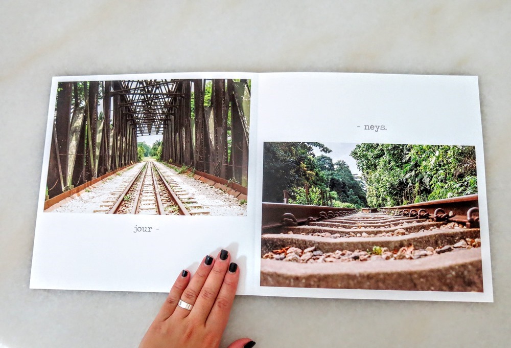
Here, you see the back cover (1st photo) & the front cover (2nd photo) because I wanted to show you the concept that we used. The front cover’s title probably does not make much sense on its own but when you read it from the back cover, it says, “Back To Basics”, which was what we wanted to convey – Film photography is about getting back to the basics because you have to use the right aperture, ISO and settings in order to capture the photograph the way you envision it to be. This journal is a collection of the husband’s vision through his film camera.
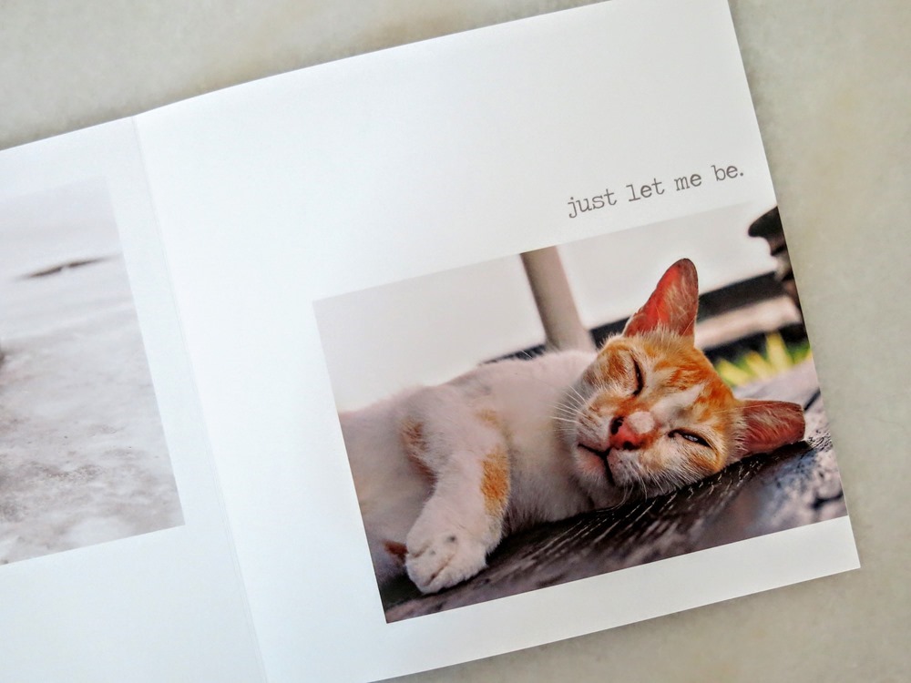
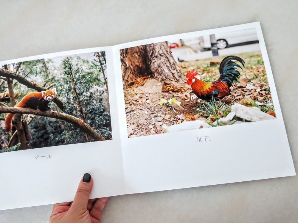
Since the focus of this journal is mainly on the photographs, we used white background on every page without any wallpapers or fancy colors. The captions were all thought of by the husband as he recalled the thoughts in his mind when he took the shots. I thought that was so meaningful and provided a rare peek into the mind of a film photographer.
The layout used was simple and neat, so as not to distract the viewers from the beauty of the photographs. That is exactly what a professional photojournal should look like, and the program helped to achieve that flawlessly.
It was a wonderful experience creating my FotoJournals with Canon, and the satisfaction & joy of holding a beautifully printed copy of our photographs in our hands is unexplanable. The final products are extremely high-quality and very professional-looking, and after I’ve submitted my final draft of the photojournals, I received notification (SMS & Email) after 5 working days that the albums were ready for collection (You can choose which outlet to collect your albums from after you’ve completed the design work). They certainly didn’t disappoint. In fact, they way exceeded my initial expectations! They are unique, only-one-in-the-world and most certainly an encouragement for us to continue this passion for photography.
If you have tons of photographs stored in your computer, why don’t you consider printing them out using Canon HD FotoJournals? It would open up a whole new world of possibilities for you, I promise. It’s addictive!
Thank you, Canon, for this review opportunity!
Disclosure: The J Babies was provided with two complimentary FotoJournals for purpose of review, and no other compensation was received. All photographs used and opinions expressed in this post are solely mine.
![]()


No comments :
Post a Comment